

Tuesday, 1 February 2011
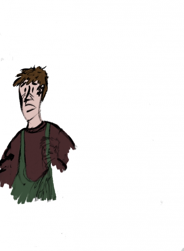
Final Character Design?
I think I've finally hit a breakthrough, hopefully this will work as my main character. Usinig the sketches I did yesterday as inspiration, I combined all of the best parts that worked and created this image.
 Although Some of the colouring needs changed (character looks a little ghostly, needs better skin tones, texture levels need sorted, the hands are far too small), overall, I think its the best one that i've done. I think this design conveys the characters 'feel' the best out of all of the designs that I have done.

Further Character designs
Siince doing more experiments with the backgrounds for my animation, I've had to adapt my character designs to fit. This was extremely hard and took a whole day just to make anything even resembling progress.
 This was the first set of designs, I began by drawing some thumbnail sillouettes to get an idea of the 'feel' I wanted the character to have by trying out different poses from the animation. Using photographs from the internet as reference I tried to give the character a scruffy look, this didn't really work. I don't really like any of the drawings on these pages at all, non of them seem to work at all. I've decided to change the character slightly from what I originally planned, he's no longer a fisherman, now he's something of a scrawny shy person. I wanted the fact that this shy and weedy person killing someone is something that the audience does not expect, I wanted to make the fact that the character had it in him to kill another human being to be something that makes him afraid and drives his madness.

 With the drawings on the left I've tried to make the cheekbones more pronounced and i've tried to make him look physically weaker. I'm not really happy with the drawings on the left because the pointed facial features and the facial hair make it harder for the audience to relate to him as a protagonist. I want the audience to be shocked that he has left a man for dead. I want the audience to invest in the character and then have their emotional connection turned on its head.
The drawings on the right hand page are a lot better, I have elongated the face and added glasses to make him look more studious (the glasses can then be dropped in the water and used as a plot device). These drawings are definetly heading in the right direction and have provided me with a few ways that I can adapt and tweak some of the story elements to make them more effective.


These pages are slightly better, I've pushed the period clothing more so that the story can be placed in an identifiable time. I've spent a lot of time experimenting with different face shapes and facial features that will help describe my character better at a glance. Allthough these pages are definetly better than the others, the images still arent as effective as they could be. The characters on this page are far too well built to be considered shy and weak.

The drawings on the right hand page are a lot better, I have elongated the face and added glasses to make him look more studious (the glasses can then be dropped in the water and used as a plot device). These drawings are definetly heading in the right direction and have provided me with a few ways that I can adapt and tweak some of the story elements to make them more effective.
Friday, 28 January 2011
Further Background experiments...


I think that there is perhaps a little too much detail in this image, which may distract the viewers eye from the action in the scene. The next step will be to add in the character with some simple animations to see if this is the case.
Background experiments
Today I tried to come up with a style for the background of my animation. Drawing backgrounds has always been one of my weaknesses as I prefer character animation. I knew what I wanted to put in my background (river, caves, trees etc) but I always struggled with protraying them in a way that would compliment my character design.
This time I tried a different technique, I started by collecting a series of photographs from the internet that featured the locations I wanted to use in my film. I then selected one of them that I felt had the same 'feel' I was looking for.


After all of the areas were coloured and shaded I used a number of different brush styles to outline the important areas of the photograph and pick out details. By doing this, I was able to tranfer my own style to the image and add or remove elements to improve the composition.


I then took this image and converted it to grayscale. The black and white version of the image was then placed on a layer above the colour original, I then turned down the opacity of the black and white layer until the colours started to come through. Using this technique I was able to alter the mood and feel of the image to match the story and themes of my film. The main character was then placed in the frame to give an idea of the final aesthetic of the film.

By using this technique I was able to maintain a sense of realism whilst at the same time enabling me to construct the image at will by adding or subtracting elements. This technique lets me imprint my own illustrative style and saves a lot of time compared to working from scratch. whilst some may consider this as 'cheating', in my opinion, as long as I still view each frame as a constructed image, as long as I do not comprimise and as long as the images are my own it may still be considered legitimate.
I have done some research and found some cave networks within driving distance from the studio, this will allow me to visit and take photographs almost exactly matching my storyboard that I can use as the basis of backgrounds for my film.
Thursday, 27 January 2011
Recent sketchbook scans




Subscribe to:
Posts (Atom)